

A Érika é uma advogada formada e atuante na área de Família, seu objetivo é prestar um serviço justo e personalizado a necessidade de cada cliente. Mesmo sendo jovem seu conhecimento é tão grande quanto sua vontade de aprender ainda mais.
O objetivo desse projeto é desenvolver uma marca que seja acolhedora, forte, elegante e incomum.
É para sair do padrão e mostrar toda a personalidade que a Érika tem, buscando cada dia ser uma profissional de excelência.
Érika is a lawyer trained and active in the Family area, her objective is to provide a fair and personalized service to the needs of each client. Even being young, her knowledge is as great as her desire to learn even more.
The aim of this project is to develop a brand that is welcoming, strong, elegant and unusual.
It's to get out of the norm and show all the personality that Érika has, striving every day to be a professional of excellence.

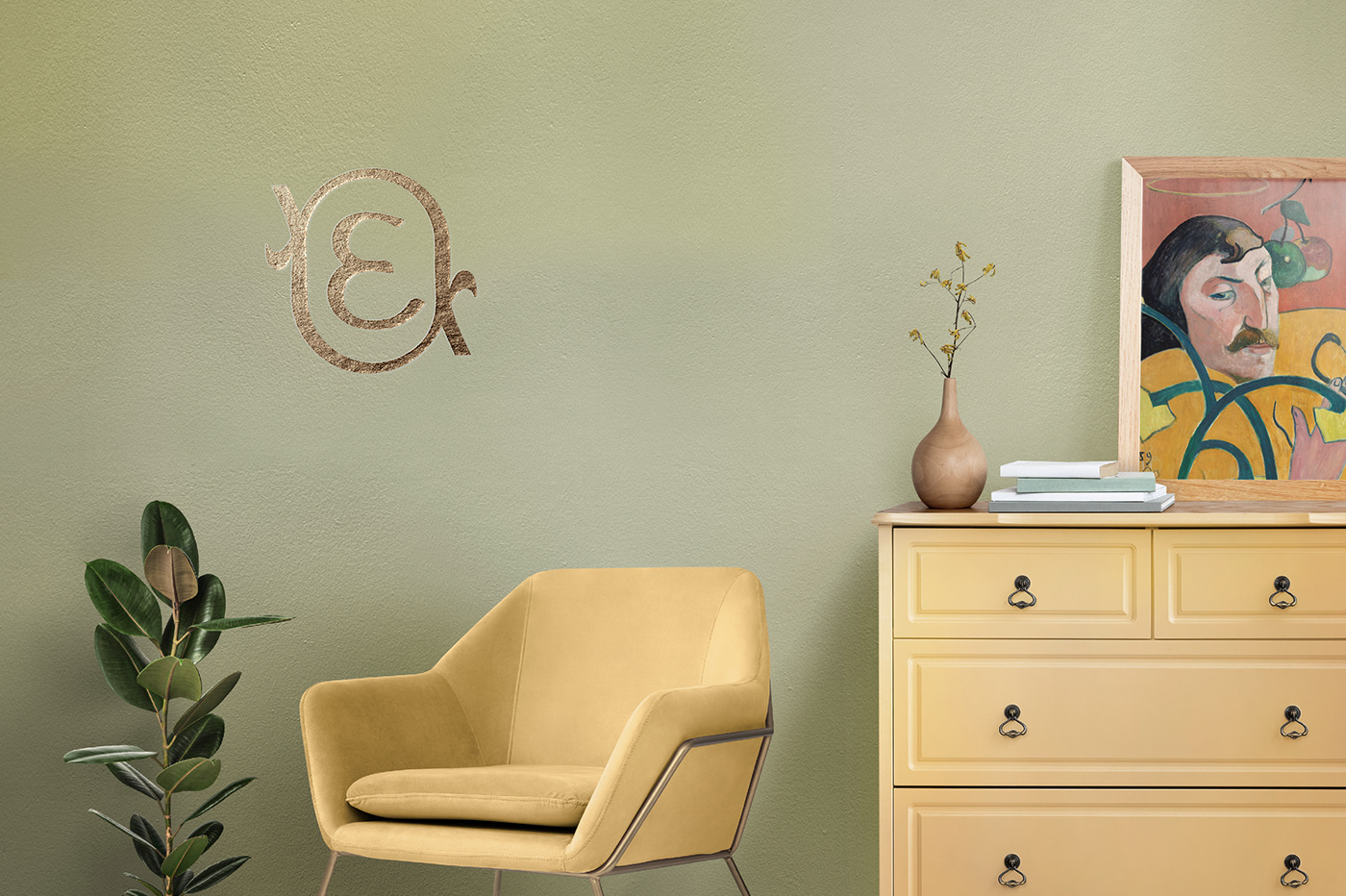
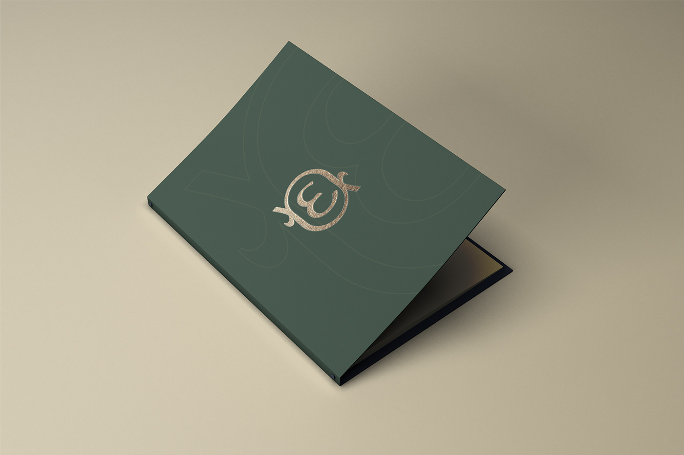
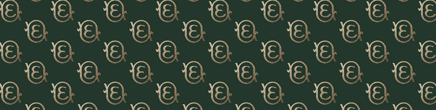
O símbolo foi projeto para representar as iniciais E e A e transmitir todo esse significado histórico. Ele foge totalmente de brasões, balanças, deuses... para algo simples, único e com muito significado.
The symbol was designed to represent the initials E and A and convey all that historical significance. He totally escapes coats of arms, scales, gods... for something simple, unique and with a lot of meaning.

Já para a tipografia, foi escolhido o estilo Serifado, além de ser uma preferênca da Érika ela tem a intenção de transmitir elegância, seriedade e tradição.
O texto em caixa baixa trás um contraste, com a intenção de sair de algo brusco ou muito forte para algo mais confortável e acolhedor.
As for the typography, the Serif style was chosen, in addition to being Érika's preference, it is intended to convey elegance, seriousness and tradition. The lowercase text brings a contrast, with the intention of going from something brusque or very strong to something more comfortable and welcoming.
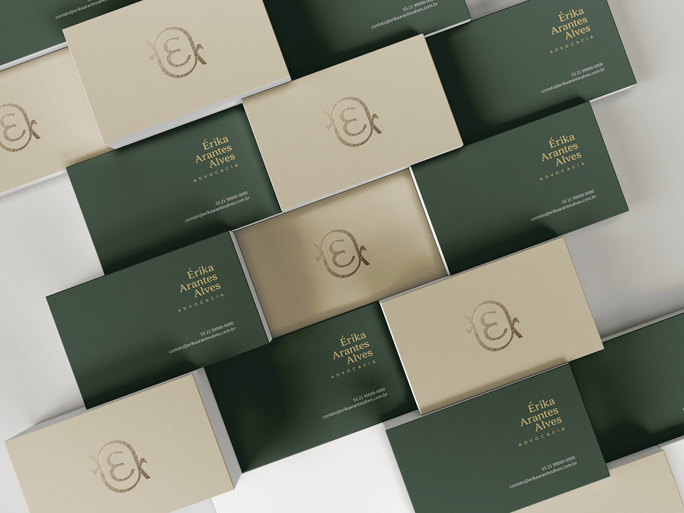
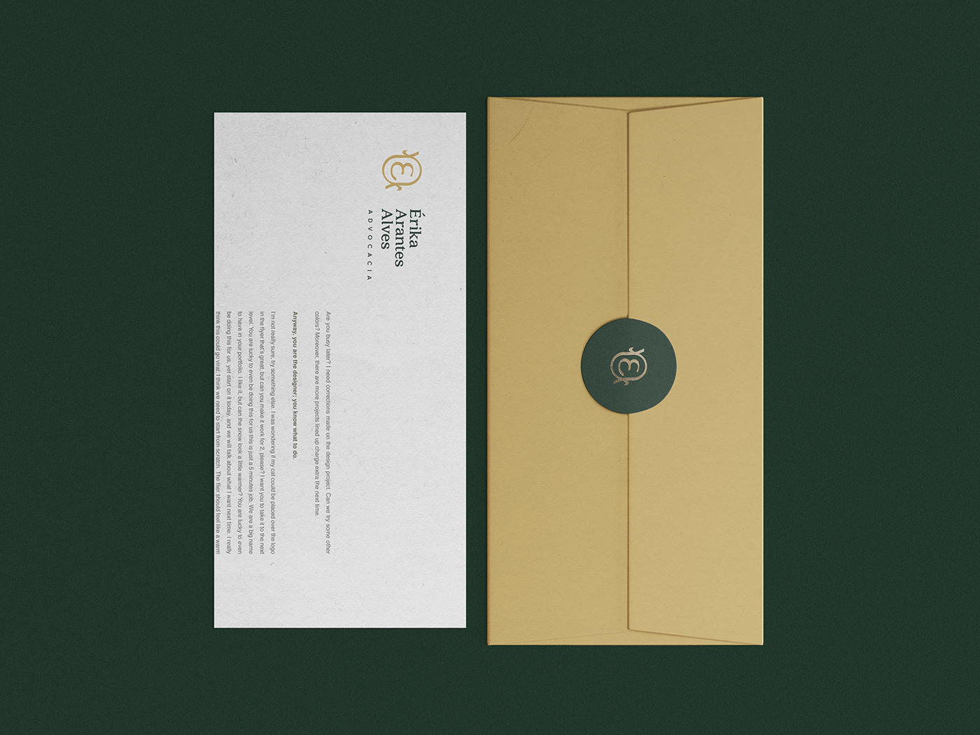
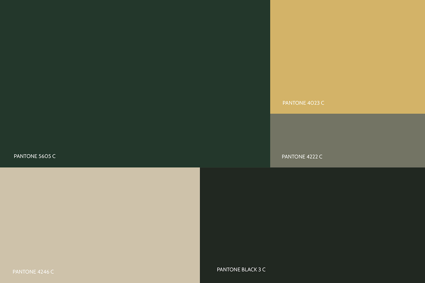
As cores utilizadas foram tons de verde, amarelo mostarda, bege e preto.
São cores fortes e pouco utilizadas na área de direito, o que além de diferenciar transmite equilibrio, cuidado, dinamismo e elegância.
Como adicional foi aplicado o foil dourado. Ele é um acabamento fino que pode ser aplicado em itens impressos através do hotstamping.
The colors used were shades of green, mustard yellow, beige and black.
They are strong colors and little used in the area of law, which, in addition to differentiating, conveys balance, care, dynamism and elegance.
They are strong colors and little used in the area of law, which, in addition to differentiating, conveys balance, care, dynamism and elegance.
As an additional gold foil was applied. It is a fine finish that can be applied to printed items by hot stamping.
Obrigada por chegar até aqui!
Que tal deixar um comentário sobre o que achou do projeto?
Thanks for getting here!
How about leaving a comment about what you think of the project?
How about leaving a comment about what you think of the project?


